UX/UI
Ride Club
Retail digital hub
Consumer choice
Mobile lab UI
AI chatbot
Lüm app
ART DIRECTION
Ride Club
U. of Wisconsin HELP
Technology marks
Trek packaging
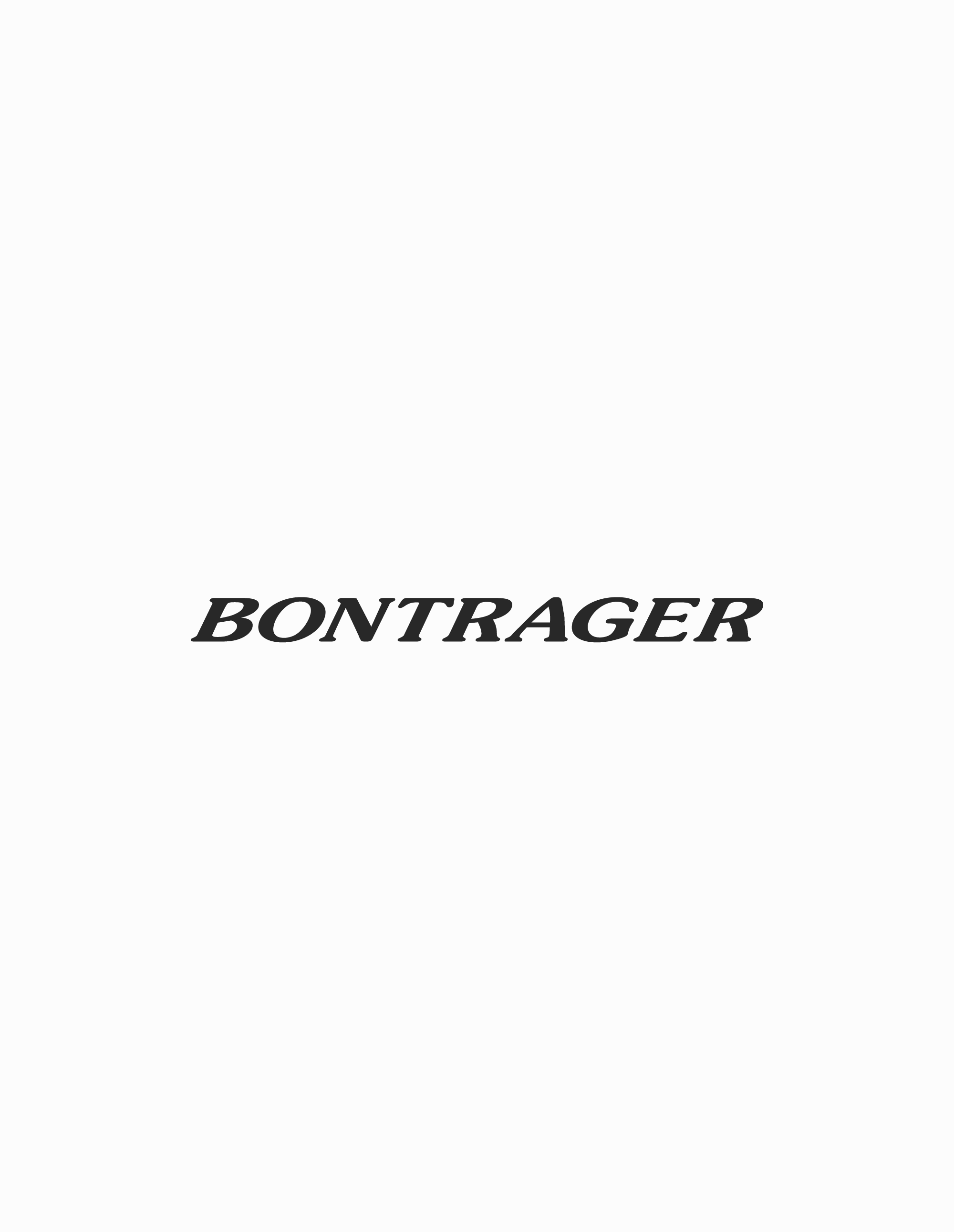
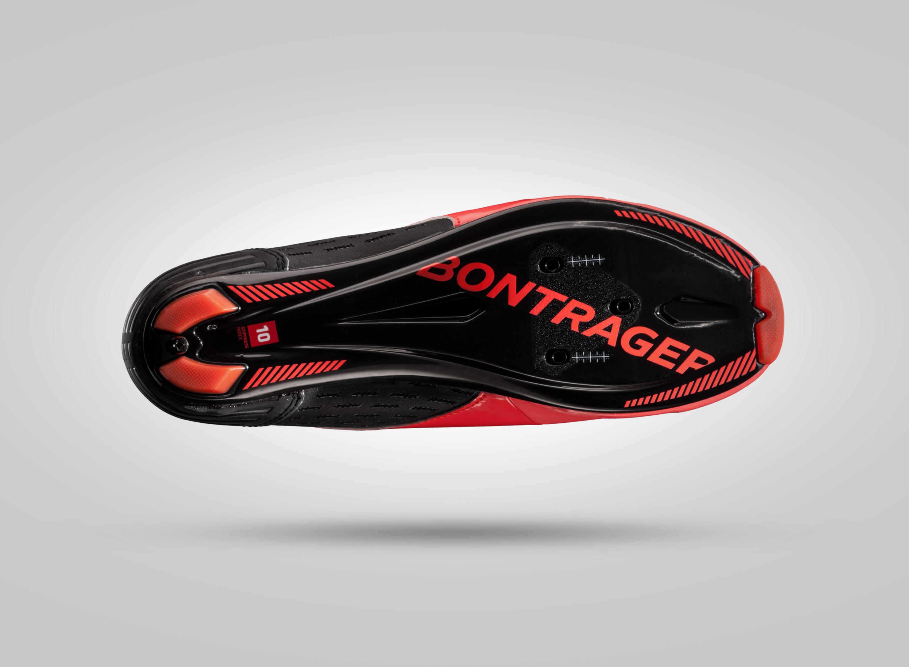
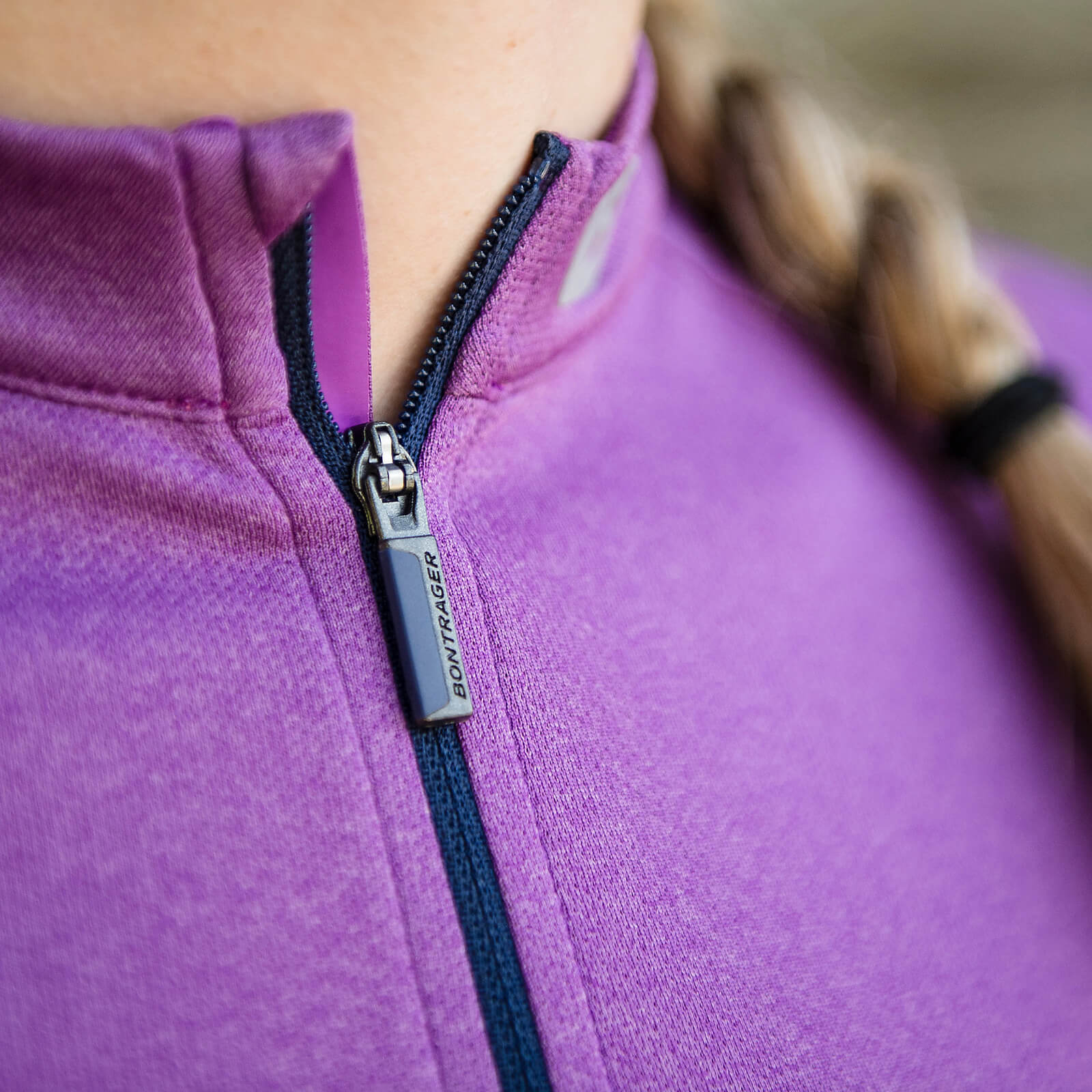
Bontrager wordmark
ABOUT
Ride Club
Experience


trek bicycle
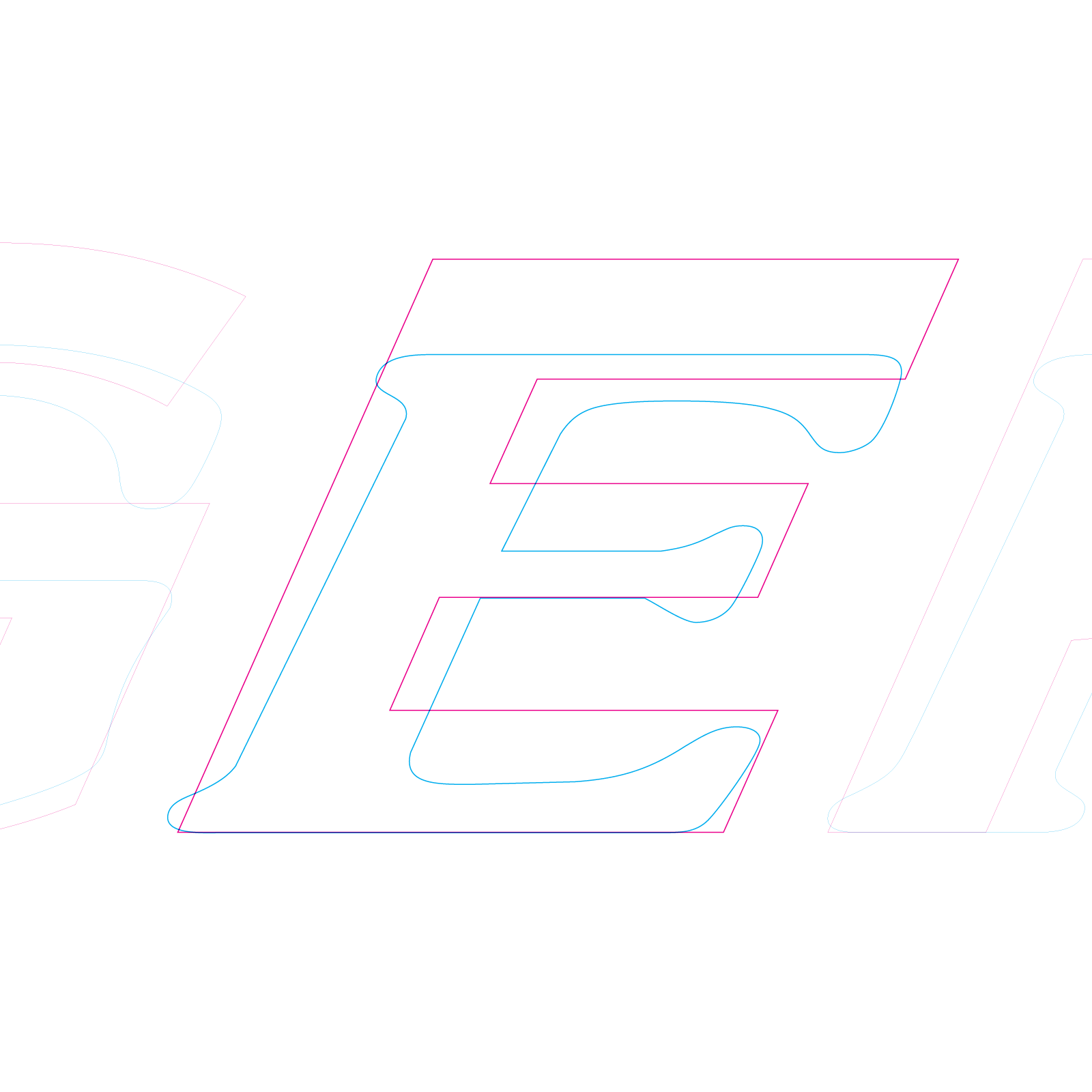
Updating a wordmark for a new era
ROLE
Instigator
Champion
Art direction
Implementation
TYPOGRAPHER
okaytype.com
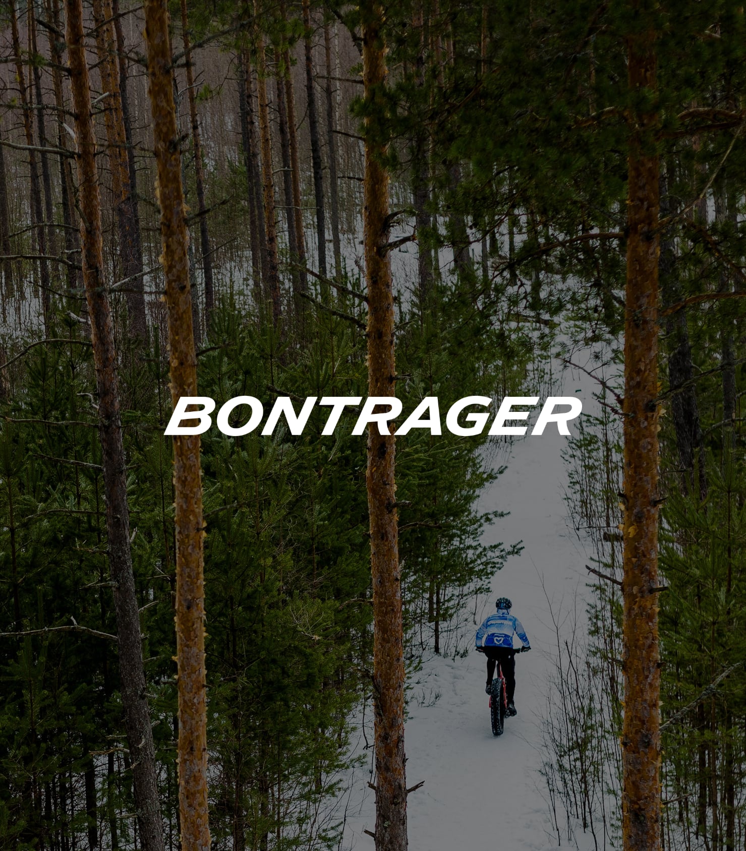
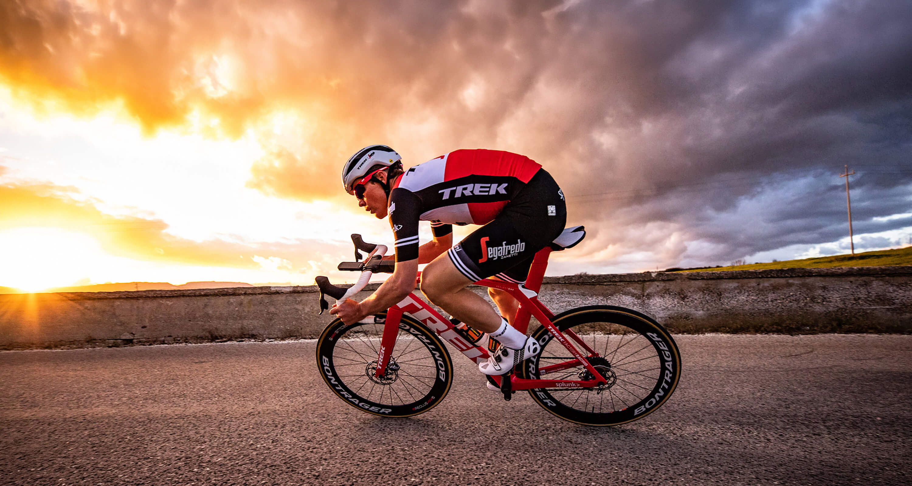
Photo: Ben Guernsey
Photo: Kaur Martin
CHALLENGE
Give a significant update to the brand’s wordmark for the first time in its 33 year history.
APPROACH
I identified the opportunity and sold the project to senior management. I then identified a talented typographer and provided creative direction for the new design. Finally, I shepherded the introduction and implementation globally across all consumer touchpoints.
RESULTS

The new wordmark design brought it into alignment with the contemporary brand, as well as the logomark which had recently been changed due to a legal challenge
The new proportion improved the wordmark’s visual weight and product graphic application opportunities
I worked closely with many partners to ensure a smooth implementation of the new wordmark globally across B2C and B2B touchpoints

Design system cohesiveness
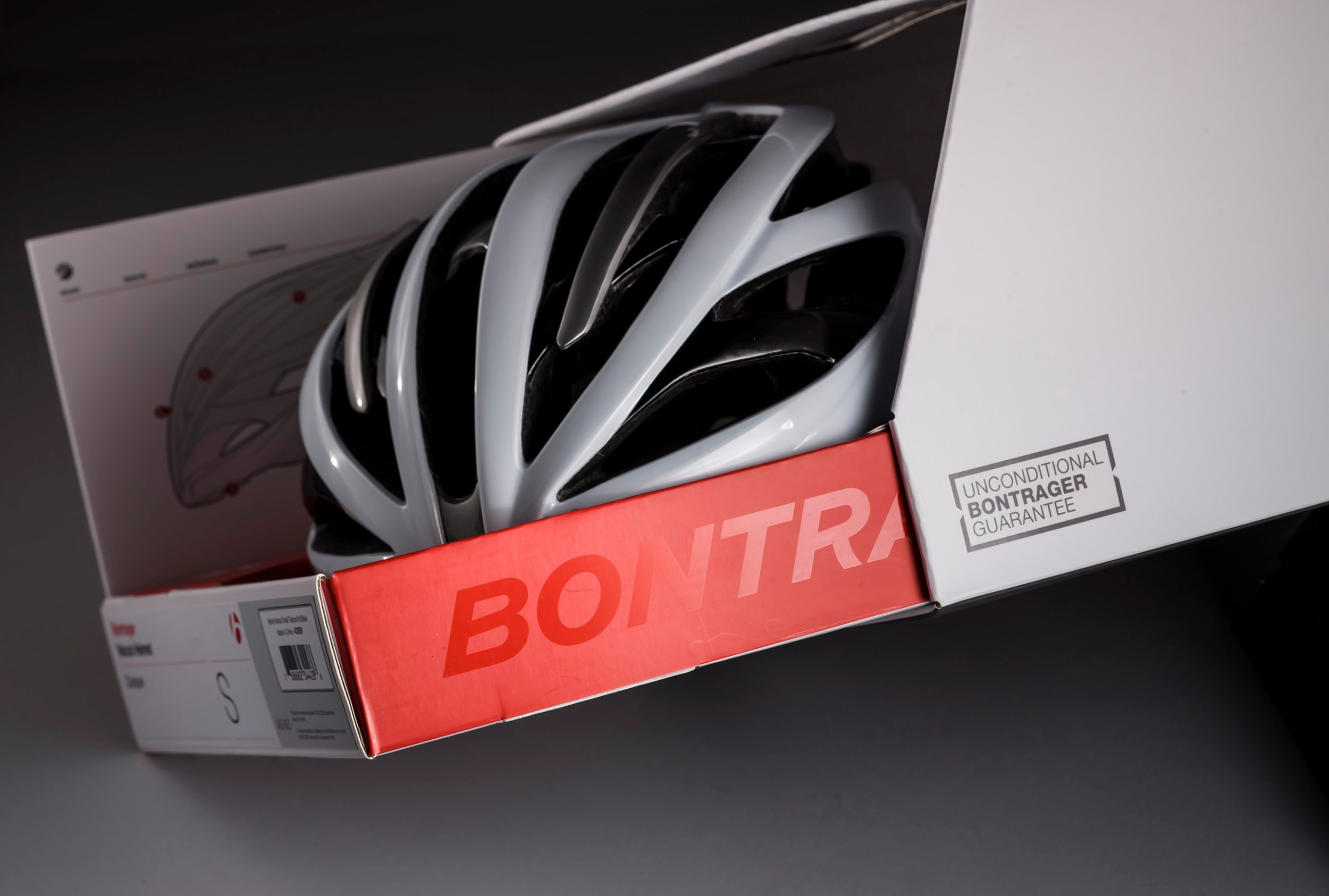
The new mark works beautifully as a large graphic device on packaging, both in ink and special finishes.


Design principles
I articulated design principles to account for the fundamentally new interaction model, as well as drive and explain design decisions.

PROJECTS
UX/UI

Ride Club
Retail digital hub
Consumer choice
Mobile lab UI
AI chatbot
Lüm app
Art direction
U. of Wisconsin HELP
Liquid Freight
Technology marks
Trek packaging
Bontrager wordmark
ABOUT
Experience
Testimonials


©2025—2026 JB
THINK HARD. DESIGN EASY.
Eric Lynn, Product Manager

Projects
About
trek bicycle
Updating a wordmark for a new era
ROLE
Instigator
Champion
Art direction
Implementation
TYPOGRAPHER
okaytype.com
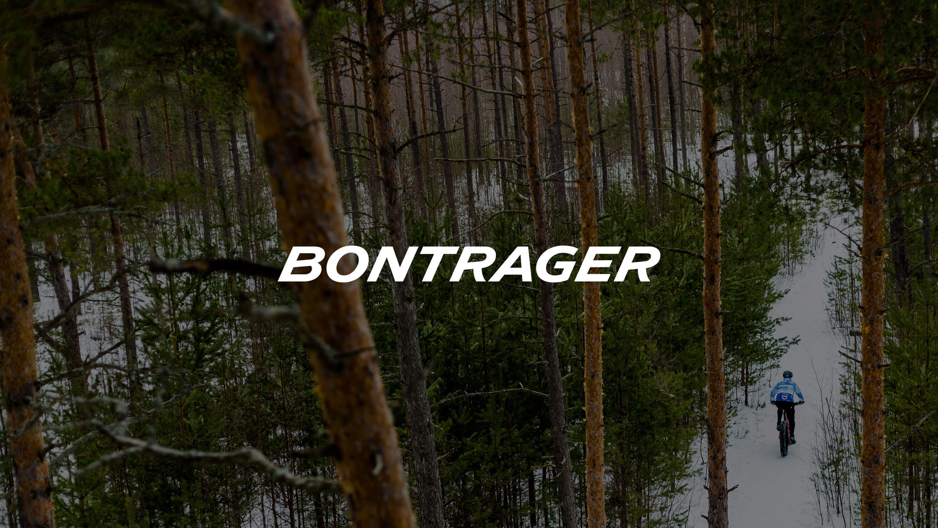
Photo: Ben Guernsey
Photo: Kaur Martin
CHALLENGE
Give a significant update to the brand’s wordmark for the first time in its 33 year history.
APPROACH
I identified the opportunity and sold the project to senior management. I then identified a talented typographer and provided creative direction for the new design. Finally, I shepherded the introduction and implementation globally across all consumer touchpoints.
RESULTS

The new wordmark design brought it into alignment with the contemporary brand, as well as the logomark which had recently been changed due to a legal challenge
The new proportion improved the wordmark’s visual weight and product graphic application opportunities
I worked closely with many partners to ensure a smooth implementation of the new wordmark globally across B2C and B2B touchpoints

Packaging
The new mark works beautifully as a large graphic device on packaging, both in ink and special finishes.
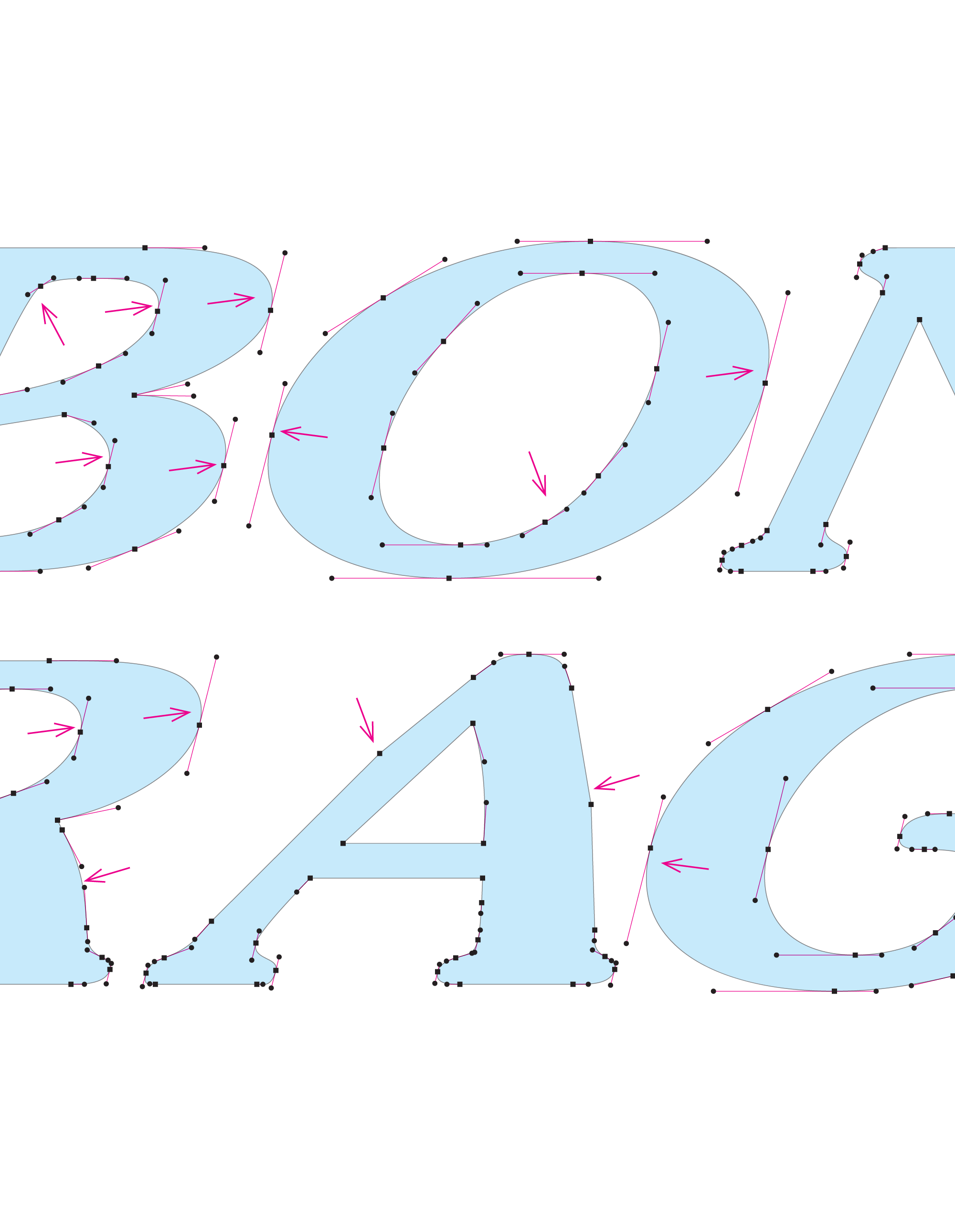
Product graphics
The wordmark must be applicable to a wide variety of shapes and sizes using a large variety of methods. The new wordmark is exceptional at small sizes and offers more presence in large applications due to the new proportion.
UX/UI
Ride Club
Retail digital hub
Consumer choice
Mobile lab UI
AI chatbot
Lüm app
ART DIRECTION
U. of Wisconsin HELP
Liquid Freight
Technology marks
Trek packaging
Bontrager wordmark
ABOUT
Experience
Testimonials


©2025—2026 JB
THINK HARD. DESIGN EASY.
Eric Lynn, Product Manager

Projects
About
trek bicycle
Updating a wordmark for a new era
ROLE
Instigator
Champion
Art direction
Implementation
TYPOGRAPHER
okaytype.com
Photo:
Kaur Martin
CHALLENGE
Give a significant update to the brand’s wordmark for the first time in its 33 year history.
APPROACH
I identified the opportunity and sold the project to senior management. I then identified a talented typographer and provided creative direction for the new design. Finally, I shepherded the introduction and implementation globally across all consumer touchpoints.
RESULTS

The new wordmark design brought it into alignment with the contemporary brand, as well as the logomark which had recently been changed due to a legal challenge
The new proportion improved the wordmark’s visual weight and product graphic application opportunities
I worked closely with many partners to ensure a smooth implementation of the new wordmark globally across B2C and B2B touchpoints

Packaging
The new mark works beautifully as a large graphic device on packaging, both in ink and special finishes.
Product graphics
The wordmark must be applicable to a wide variety of shapes and sizes using a large variety of methods. The new wordmark is exceptional at small sizes and offers more presence in large applications due to the new proportion.
UX/UI
Ride Club
Retail digital hub
Consumer choice
Mobile lab UI
AI chatbot
Lüm app
ART DIRECTION
U. of Wisconsin HELP
Liquid Freight
Technology marks
Trek packaging
Bontrager wordmark
ABOUT
Experience
Testimonials


©2025—2026 JB
THINK HARD. DESIGN EASY.