UX/UI
Ride Club
Retail digital hub
Consumer choice
Mobile lab UI
AI chatbot
Lüm app
ART DIRECTION
Ride Club
U. of Wisconsin HELP
Technology marks
Trek packaging
Bontrager wordmark
ABOUT
Ride Club
Experience


Flambeau RapidX
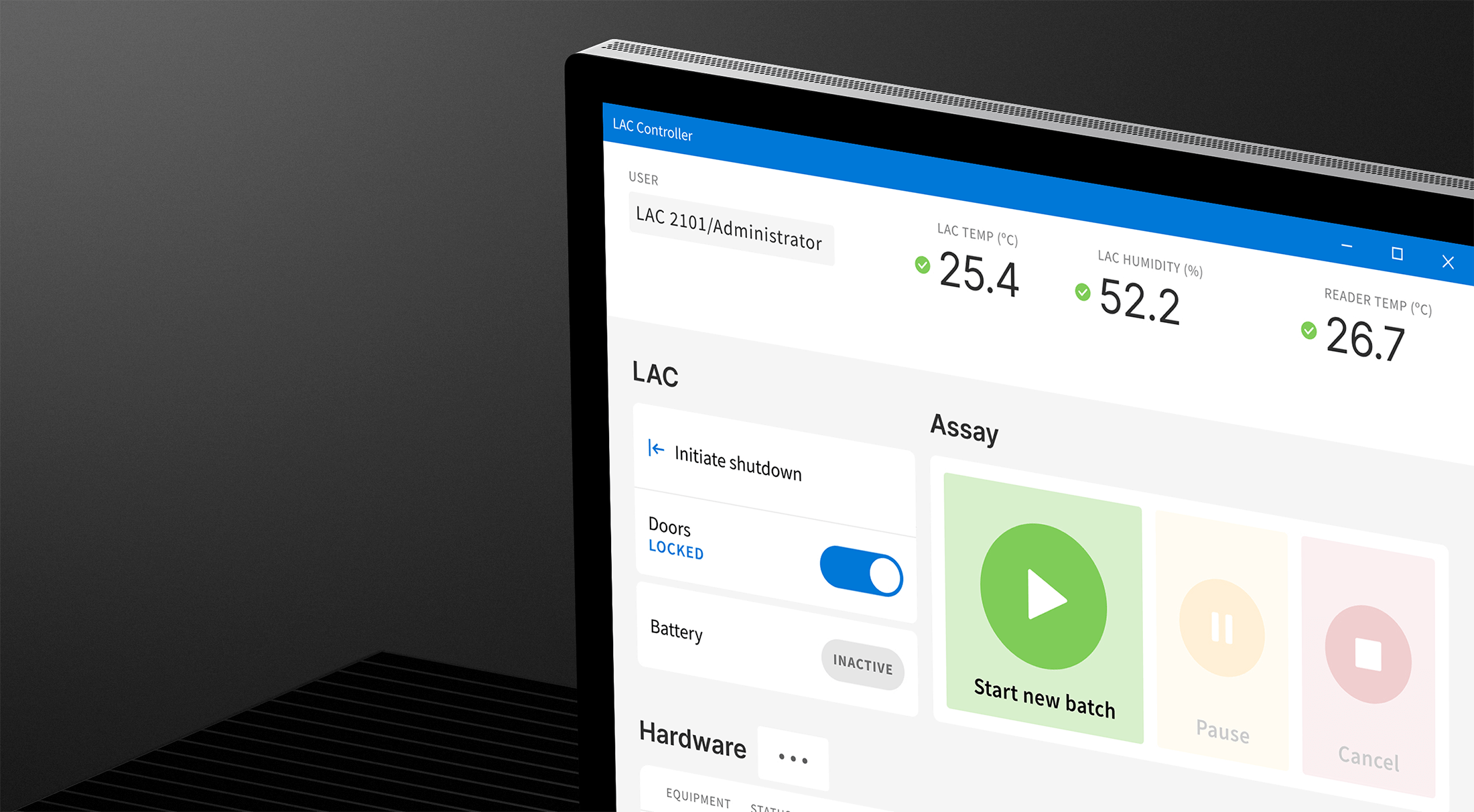
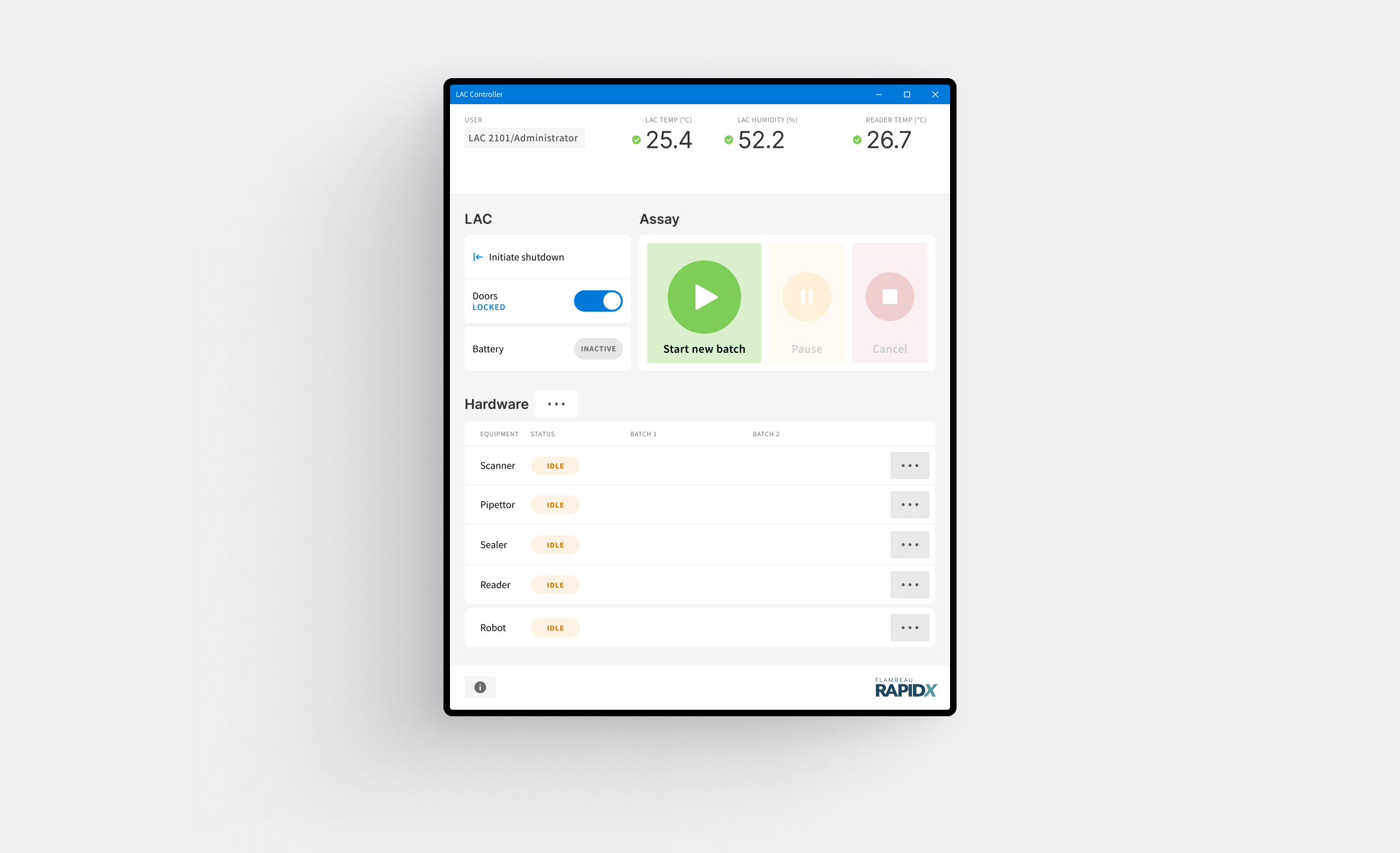
Building a user friendly UI for an innovative mobile diagnostics lab
ROLE
Lead UX and UI designer
PLATFORM
27" touchscreen / Windows app
CHALLENGE
Evolve a rudimentary development interface to a realistically viable UI to ensure continued project funding from the NIH Rapid Acceleration of Diagnostics (RADx) initiative.
APPROACH
I dug in with the client team and Delve engineers to craft a user-centered, contextually appropriate user interface for controlling RapidX’s innovative mobile lab.
RESULTS

Demonstrate required progress to pursue continued funding from NIH Rapid Acceleration of Diagnostics (RADx) initiative
User-centered thinking injected in the design process, transforming ultimate usability of the product
Client and Delve project teams could start to envision the production interface
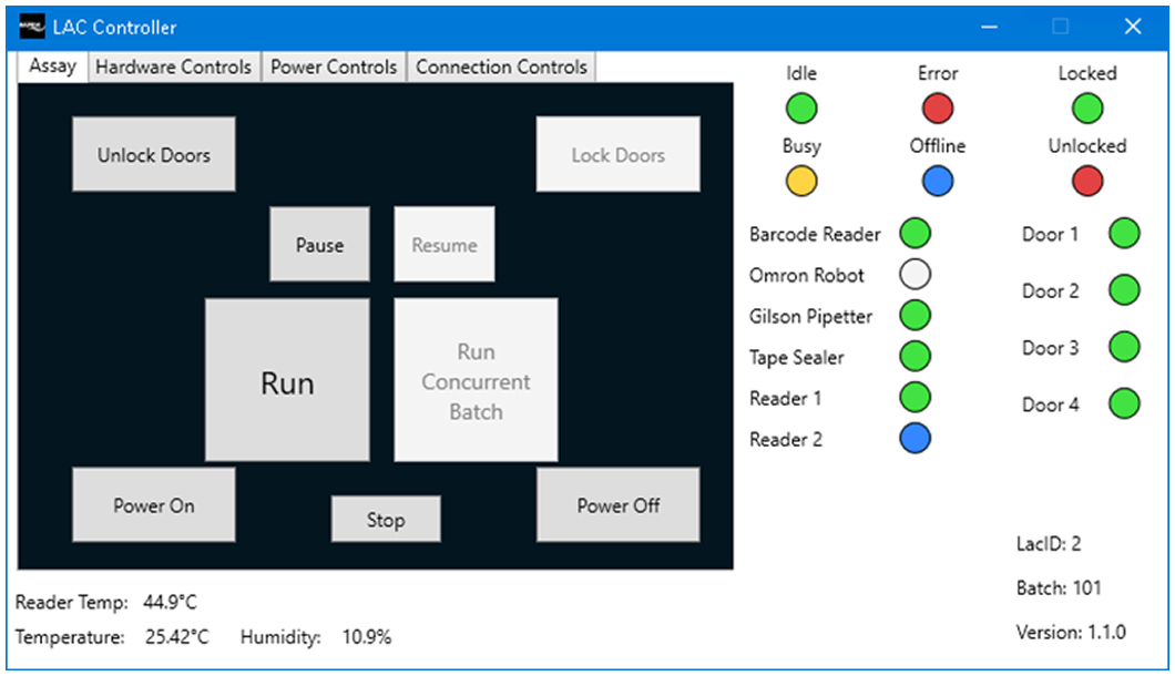
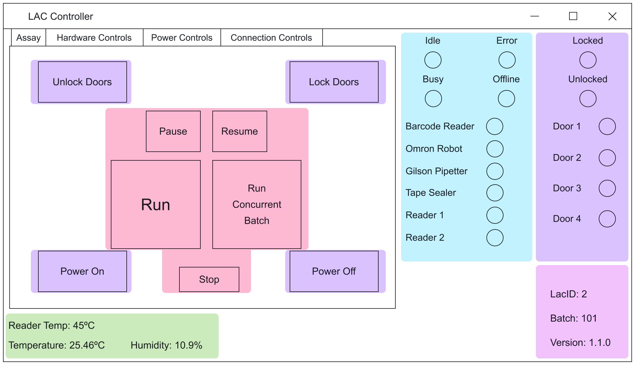
Development interface
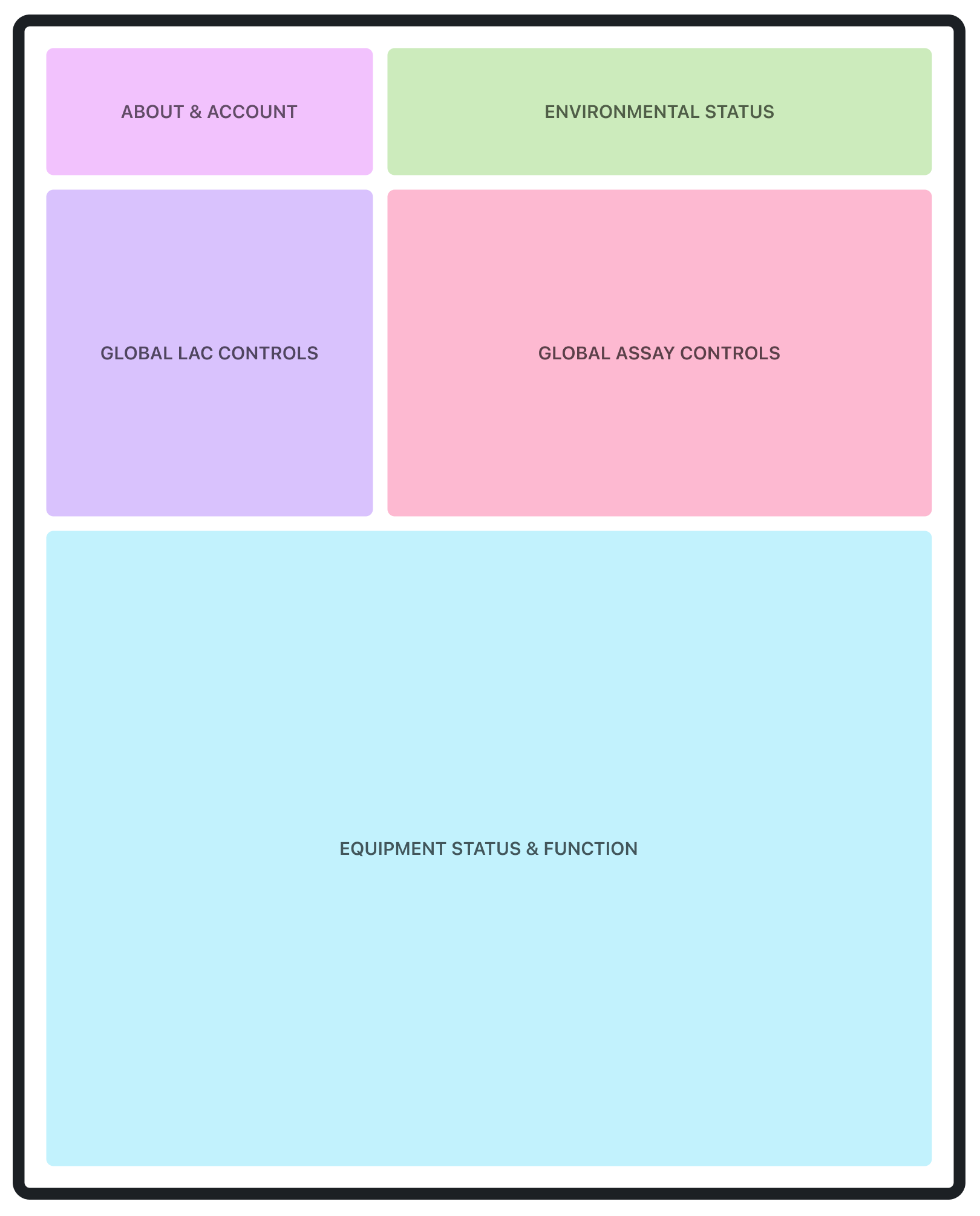
The development interface used by Delve and client teams ran on a laptop in a landscape, tabbed UI schema.
I started with an assessment of the four tabs with respect to layout and function, and created functional groupings.
ABOUT & ACCOUNT
ENVIRONMENTAL STATUS
EQUIPMENT STATUS & FUNCTION
GLOBAL LAC CONTROLS
GLOBAL ASSAY CONTROLS
Order of operations
Through direct interviews with Delve and client team users, I established an order of operations for the functional groupings.
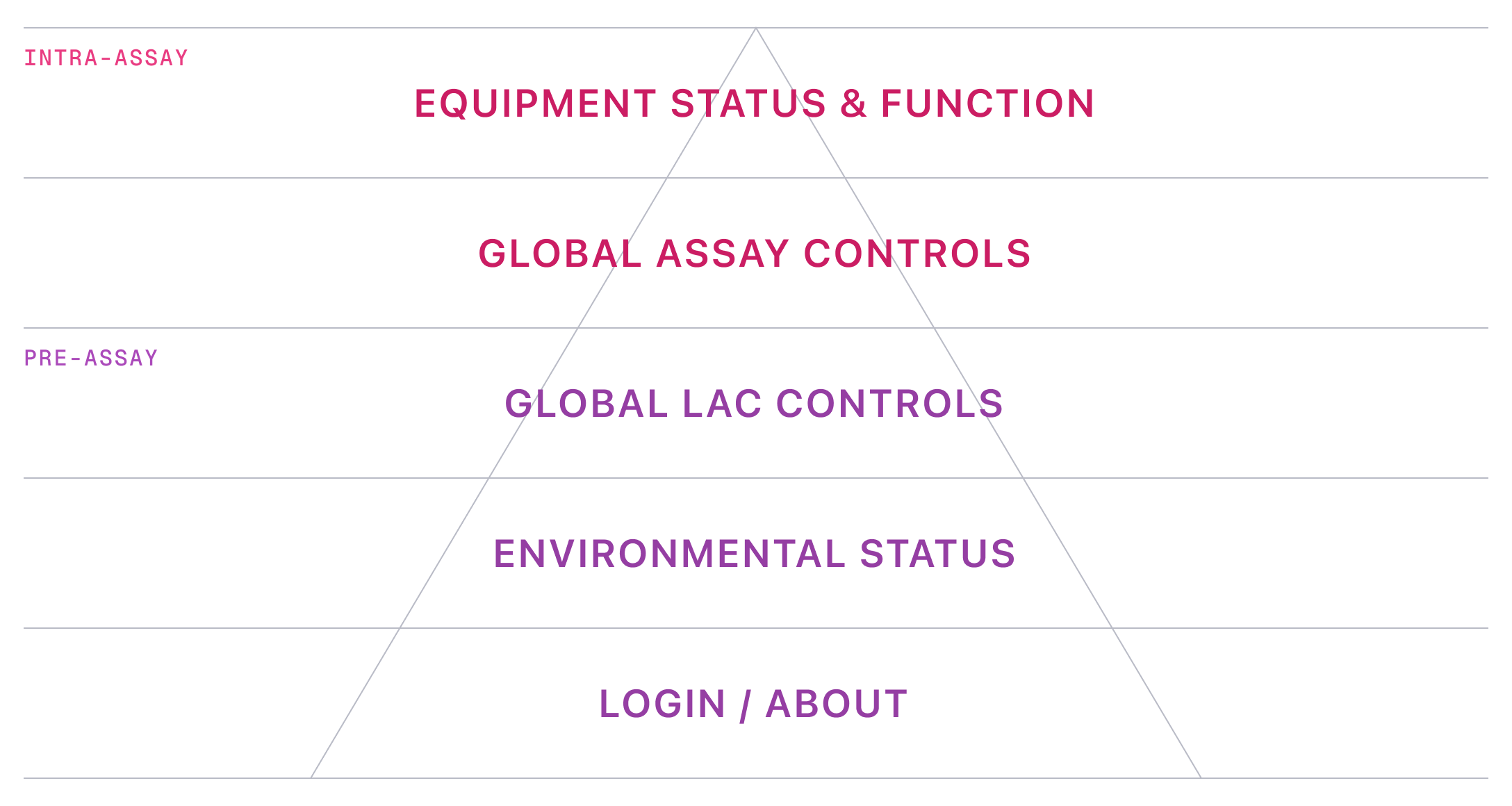
Design principles
I articulated design principles to account for the fundamentally new interaction model, as well as drive and explain design decisions.
ASSUMPTIONS & CONSTRAINTS
- Surface is shifting from a laptop (landscape) to a large touchscreen (portrait)
- Users are observing interface while assays are running
- Users may be wearing gloves
- Users may be further away than typical laptop viewing distance
PRINCIPLE 1
Dashboard-like
- present virtually all main information in one view (with intentional exceptions)
- employ a rigorous grid layout with generous spacing
- provide clear feedback and context on statuses, progress, and operation conditions

PRINCIPLE 2
Kiosk-like
- push application size to full-screen
- use generous touch targets and spacing (accommodate gloves and mitigate accidental interactions)
- increased text and icons sizes to facilitate good readability at distance
Transformation
Applying the design principles to the functional categories and order of operations, I created a fundamental transformation from the development UI to the production UI.
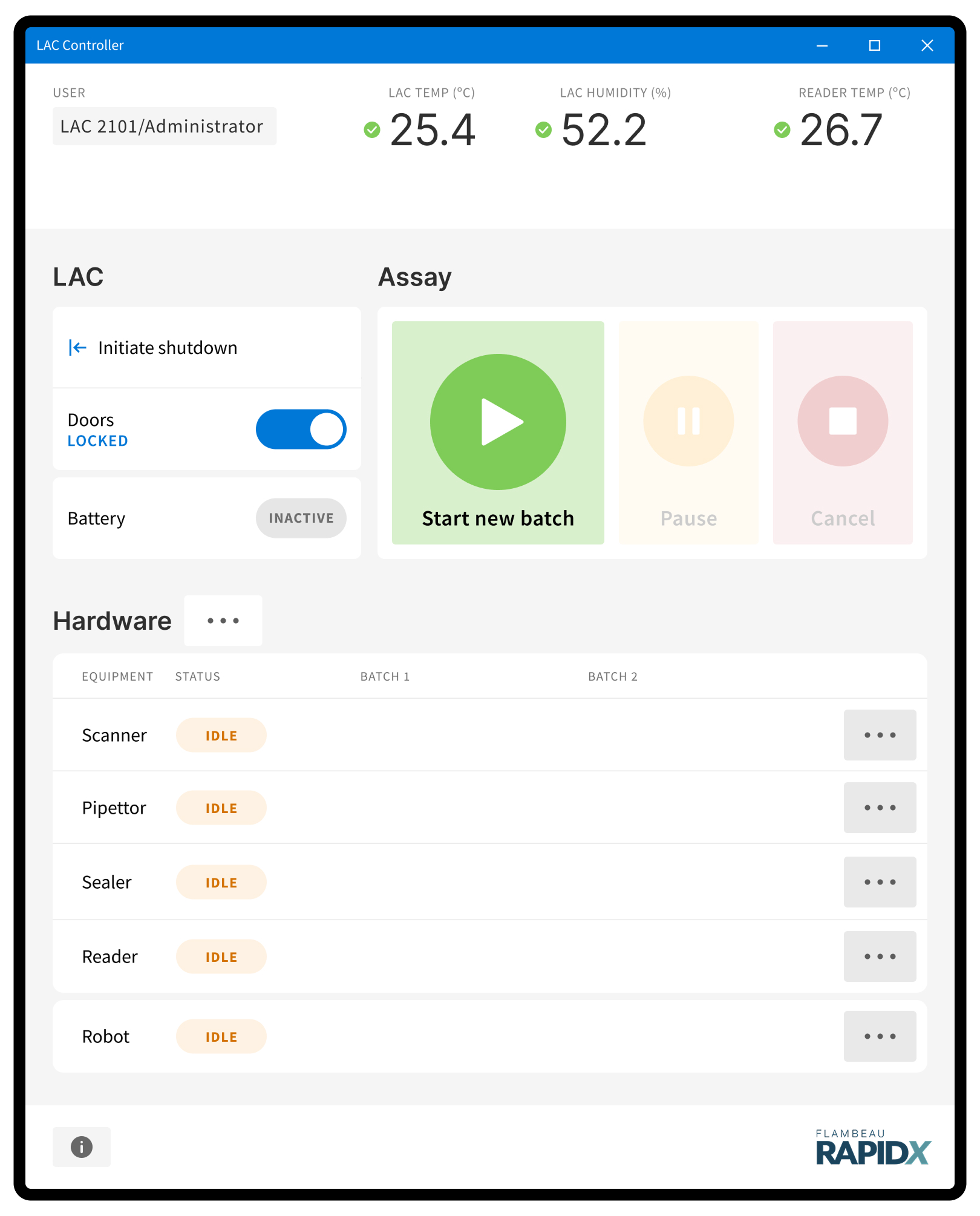
READER
PIPETTOR
ROBOT
PROJECTS
UX/UI

Ride Club
Retail digital hub
Consumer choice
Mobile lab UI
AI chatbot
Lüm app
Art direction
U. of Wisconsin HELP
Liquid Freight
Technology marks
Trek packaging
Bontrager wordmark
ABOUT
Experience
Testimonials


©2025—2026 JB
THINK HARD. DESIGN EASY.

Projects
About
Flambeau RapidX
Building a user friendly UI for an innovative mobile diagnostics lab
ROLE
Lead UX and UI designer
PLATFORM
27" touchscreen / Windows app
CHALLENGE
Evolve a rudimentary development interface to a realistically viable UI to ensure continued project funding from the NIH Rapid Acceleration of Diagnostics (RADx) initiative.
APPROACH
I dug in with the client team and Delve engineers to craft a user-centered, contextually appropriate user interface for controlling RapidX’s innovative mobile lab.
RESULTS

Demonstrate required progress to pursue continued funding from NIH Rapid Acceleration of Diagnostics (RADx) initiative
User-centered thinking injected in the design process, transforming ultimate usability of the product
Client and Delve project teams could start to envision the production interface
Development interface
The development interface used by Delve and client teams ran on a laptop in a landscape, tabbed UI schema.
I started with an assessment of the four tabs with respect to layout and function, and created functional groupings.
ABOUT & ACCOUNT
ENVIRONMENTAL STATUS
EQUIPMENT STATUS & FUNCTION
GLOBAL LAC CONTROLS
GLOBAL ASSAY CONTROLS
Order of operations
Through direct interviews with Delve and client team users, I established an order of operations for the functional groupings.
Design principles
I articulated design principles to account for the fundamentally new interaction model, as well as drive and explain design decisions.
ASSUMPTIONS & CONSTRAINTS
- Surface is shifting from a laptop (landscape) to a large touchscreen (portrait)
- Users are observing interface while assays are running
- Users may be wearing gloves
- Users may be further away than typical laptop viewing distance
PRINCIPLE 1
Dashboard-like
- present virtually all main information in one view (with intentional exceptions)
- employ a rigorous grid layout with generous spacing
- provide clear feedback and context on statuses, progress, and operation conditions

PRINCIPLE 2
Kiosk-like
- push application size to full-screen
- use generous touch targets and spacing (accommodate gloves and mitigate accidental interactions)
- increased text and icons sizes to facilitate good readability at distance
Transformation
Applying the design principles to the functional categories and order of operations, I created a fundamental transformation from the development UI to the production UI.
READER
PIPETTOR
ROBOT
UX/UI
Ride Club
Retail digital hub
Consumer choice
Mobile lab UI
AI chatbot
Lüm app
ART DIRECTION
U. of Wisconsin HELP
Liquid Freight
Technology marks
Trek packaging
Bontrager wordmark
ABOUT
Experience
Testimonials


©2025—2026 JB
THINK HARD. DESIGN EASY.